Accessing survey scores
To view the scores for individual questions in your survey, navigate to the Scores tab within the results dashboard.
Once in the Scores tab, you can select comparison scores to analyze your results. These comparisons can be made against:
- Higher-level scores, such as benchmarks, the entire organization, or previous survey results.
- Lower-level scores, such as specific teams or departments within your organization.
To choose a comparison, click on the Comparisons field and select either higher-level scores (e.g., organizational benchmarks) or lower-level scores (e.g., team-level results).
For a comprehensive guide on using the results dashboard, refer to: How to use the results dashboard.
For more information on how to compare results, please refer to: Results dashboard: Comparing of results.
Understanding the scores
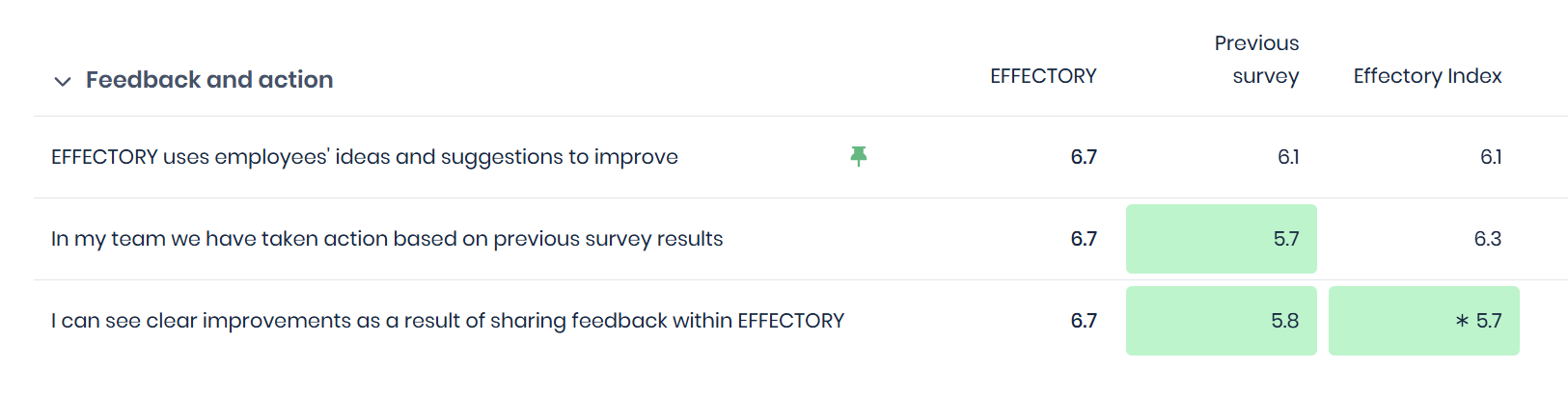
To help you read and understand the scores, the results show whether scores have absolute differences and/or statistical significance. Absolute differences (coloring of the scores) reflect whether this difference is practically noticeable, while statistical significance (*) indicates if a difference between scores is real rather than due to random chance.
Interpreting these together helps determine whether a result is important enough to act on immediately, monitor over time, investigate further, or safely ignore.
Which is more important: the asterisk (*) or the color difference?
They serve different purposes:
- The asterisk (*) tells you that a difference is statistically significant.
- The color shows the absolute difference, which might still be important even if not statistically significant. Since it is less likely to have a significant difference on smaller groups, the coloring helps you point out differences even on lower levels.
- Together, they provide a more complete picture of the data.
Understanding the coloring of the scores
The colors in the dashboard represent differences in absolute scores:
- Green indicates a positive difference (your score is higher than the comparison group).
- Red indicates a negative difference (your score is lower than the comparison group).
- The shade of the color represents the magnitude of the difference—the darker the shade, the greater the absolute difference from the comparison group.

Why use absolute differences?
- Consistency and clarity: Absolute differences provide a standardized and easily interpretable comparison.
- Relevance: Absolute differences ensure a uniform evaluation regardless of sample response.
Understanding significance
The asterisk (*) in the results dashboard represents whether a difference in scores is significant, meaning whether it is statistically meaningful and not likely caused by chance. This helps in identifying patterns in employee feedback.
If a score is marked as significant, it means that the difference is statistically meaningful at a 95% confidence level; in other words there is a 95% probability that it is not due to random variation. This helps users understand which changes in scores reflect actual trends rather than chance fluctuations.
Should I only look at significant differences?
Not necessarily. While significance helps highlight key differences, other insights might still be valuable, even if not statistically significant. It’s always best to use significance as one of multiple factors when interpreting data.
Understanding the differences
By combining absolute differences with statistical significance, scores can be grouped into four distinct categories.
- No absolute difference (color) and no significant difference (*)
- No absolute difference (color), but significant difference (*)
- Absolute difference (color), but no significant difference (*)
- Absolute difference (color) and significant difference (*)